BEAUTY + STYLE
Pantone’s Color of the Year 2017 is Fresh and Natural
 Source: Pinterest
It’s been popping up in interior design showcases for the past few months, so it’s no wonder Pantone chose a green hue for their Pantone Color of the Year 2017.
 Source: Pinterest
The spring-like hue, aptly named ‘greenery’ is, according to Pantone “A fresh and zesty yellow-green shade that evokes the first days of spring when nature’s greens revive, restore and renew…Greenery is nature’s neutral. The more submerged people are in modern life, the greater their innate craving to immerse themselves in the physical beauty and inherent unity of the natural world.”
 Source: Pinterest
Possibly due to the tumultuous election we have just been through, there has been a leaning towards creating calm, peaceful and minimalist environments in our home and Pantone’s shade of green evokes just that. As Pantone’s executive director, Leatrice Eiseman reveals, “Greenery bursts forth in 2017 to provide us with the reassurance we yearn for amid a tumultuous social and political environment…Greenery symbolizes the reconnection we seek with nature, one another, and a larger purpose.”
 Source: Pinterest
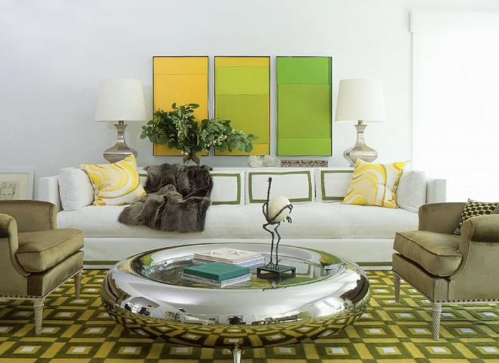
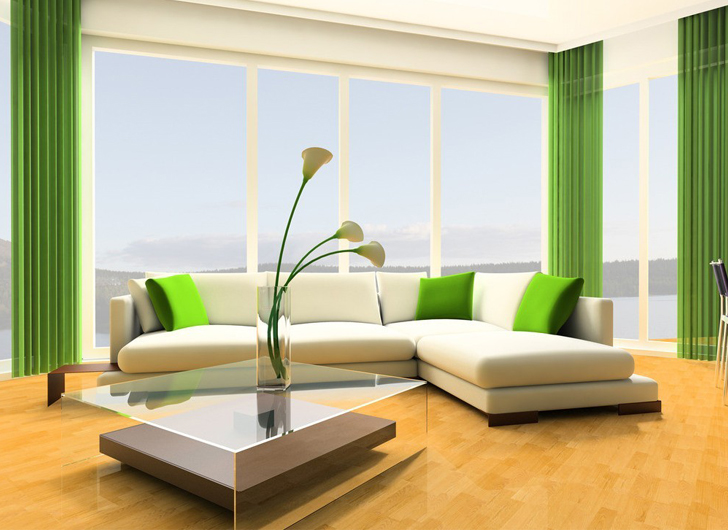
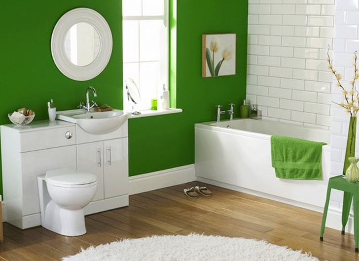
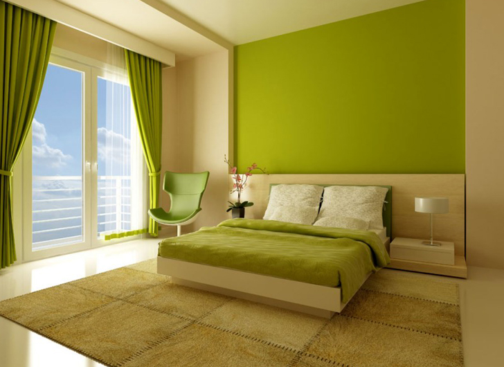
Greenery makes perfect additions to the home in a supporting role. Try adding this hue in scatter cushions, drapes, linens, vases, kitchen ware and decor. Pick out one wall to paint in this fresh shade, or frame black and white photographs in green to make them pop against a blank wall. Paired against white, the hue looks fresh, simple and full of spring vitality.